Occupational Health Consultation Tool
Project Overview
The occupational health consultation tool allowed professionals to consult employees, but its usability was poor due to the need to switch between three screens. After user research and iteration, I redesigned the interface into a single screen, streamlining the process. This improvement led to positive user feedback, higher satisfaction, and new clients.
- Timeline
- 1 person-month
- Role
- UX/UI Design, UX Research
- Tool
- Figma
- Company
- mediPhone, inc.
- Team
- 2 engineers, 1 project owner, Product Designer (myself)
- Impact
- The redesigned feature contributed to new contracts, resulting in a 4% increase in ARR.
This project was originally created in Japanese for a Japanese audience. The text has been translated into English for this portfolio.
The Situation
The Product
In Japan, employees with health issues are required to consult with occupational health professionals. mediment offers an Occupational Health Consultation Tool to streamline interactions between professionals and employees, and to report employees’ health conditions to HR managers.
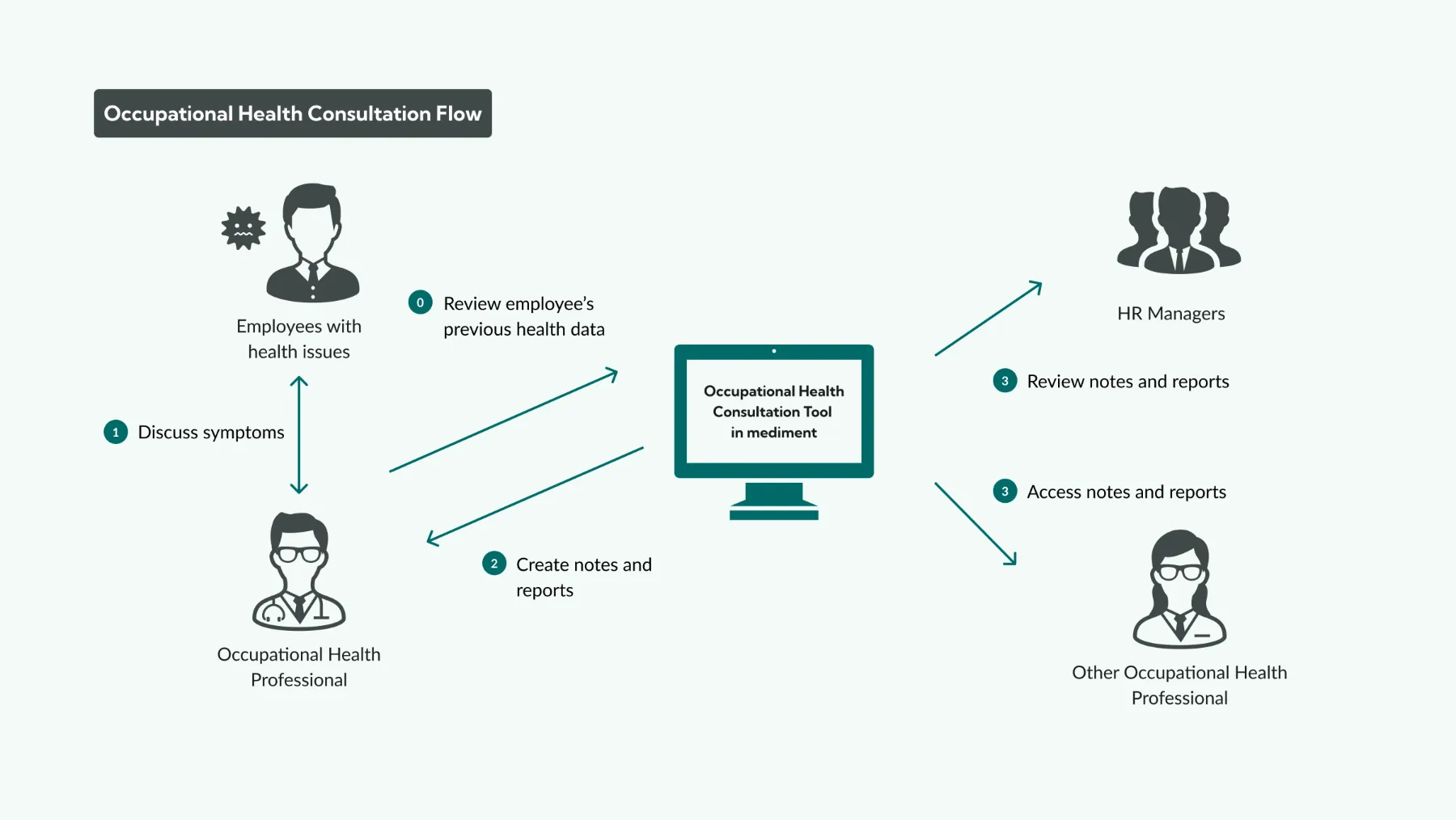
Problem
Busy users had to switch between three separate pages, making it difficult to take notes while reviewing documents during consultations. The interface needed to let users view documents and take notes seamlessly.
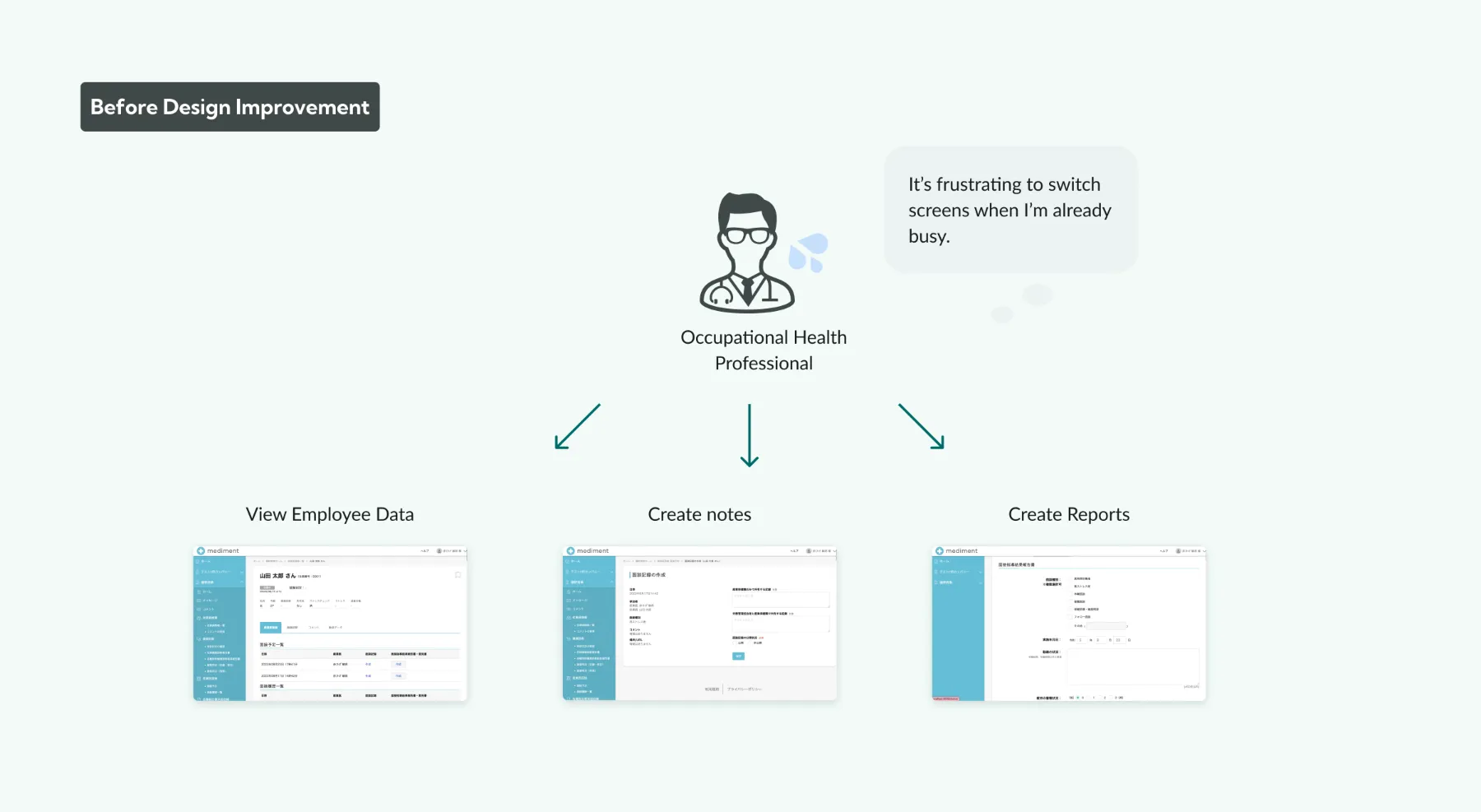
Goal
Allow occupational health professionals to smoothly take consultation notes while viewing the necessary documents during consultations.
Constraints
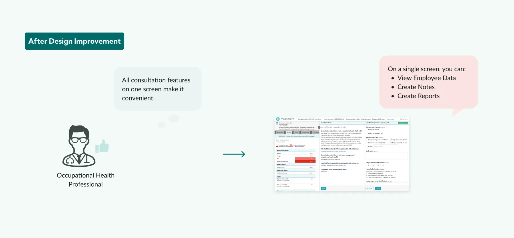
All consultation tasks needed to be completed in one place. I referenced familiar electronic medical record interfaces used by physicians so users could understand the layout and work efficiently.
Solution
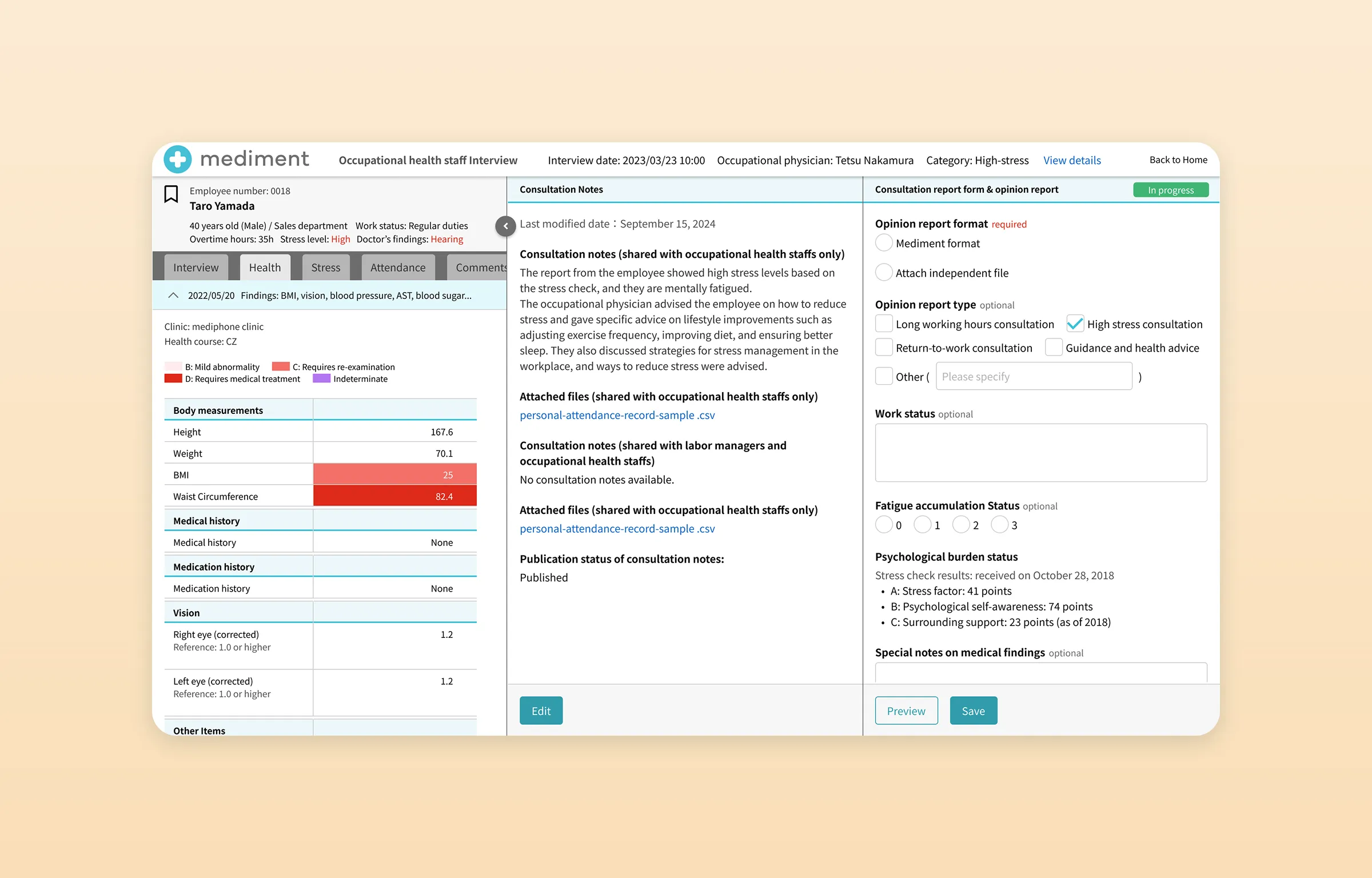
I designed a workspace where occupational health professionals can take consultation notes while viewing all necessary documents in one place.
Design Process
After consulting with the designers, I followed a process based on design thinking.

Research
User Interviews
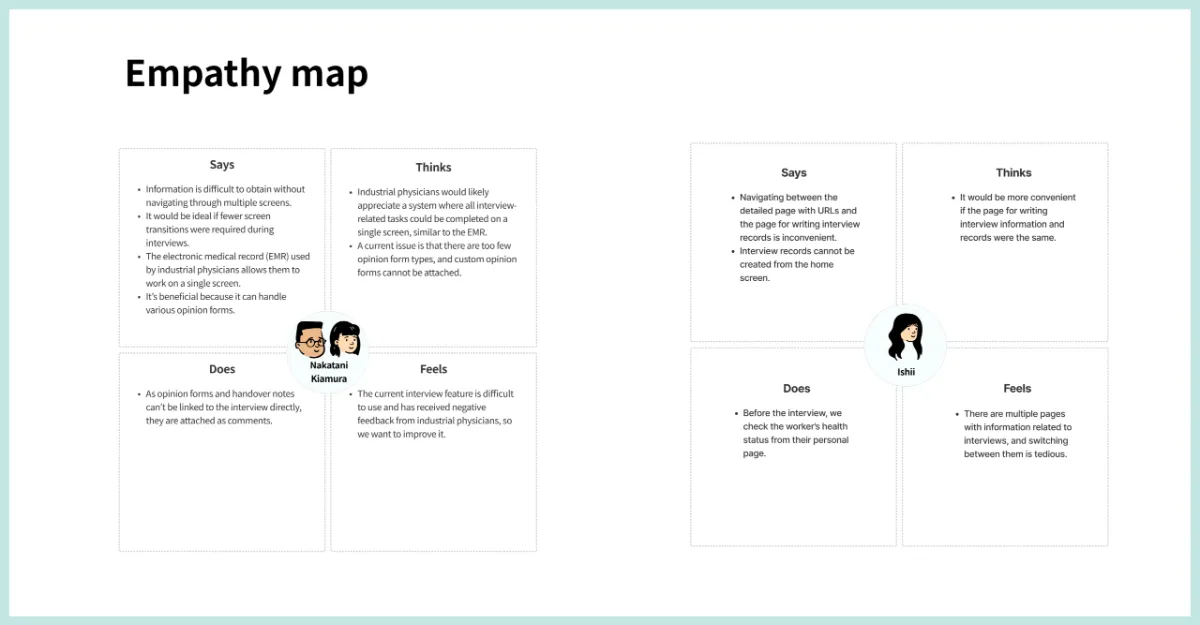
I interviewed people involved in occupational health tasks to understand how they conduct consultations and identify issues with the existing features.
I then organized their statements and thoughts into an empathy map.
Competitive Audit
I investigated other occupational health consultation tools, as well as hospital consultation services. Although hospital tools were not direct competitors, their interfaces offered useful insights into familiar workflows for health professionals.
| Service | Feature | Strengths | Weaknesses |
|---|---|---|---|
| Carely | A health management system for HR, occupational health professionals, and public health nurses, bringing interviews, notes, and health information together on one screen. | Integrated features improve workflow efficiency. | Opinion letters cannot be created while reviewing interview records. |
| Henry | A smartphone-like interface for managing patient data with a clean, easy-to-understand layout. | Simple, clean design avoids overcrowded screens. | Some functions may require more detailed guidance. |
| CLINICS | A cloud-based electronic medical record system for appointments, diagnosis, and billing. | A seamless experience across administrative and medical tasks. | The number of features can create a steep learning curve. |
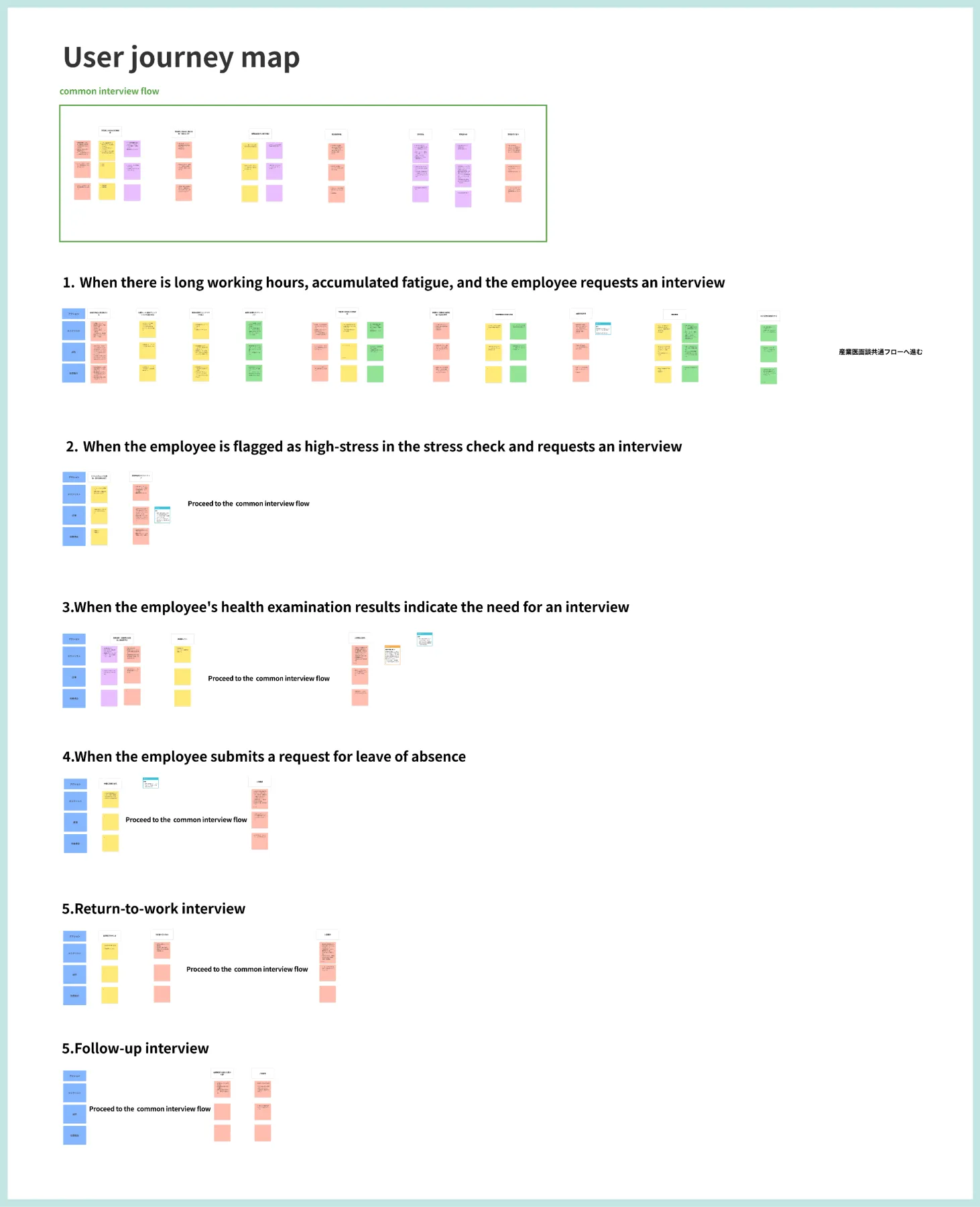
User Journey Map
I mapped the tasks, emotions, and opportunities for improvement as users interact with the consultation feature.
Ideation
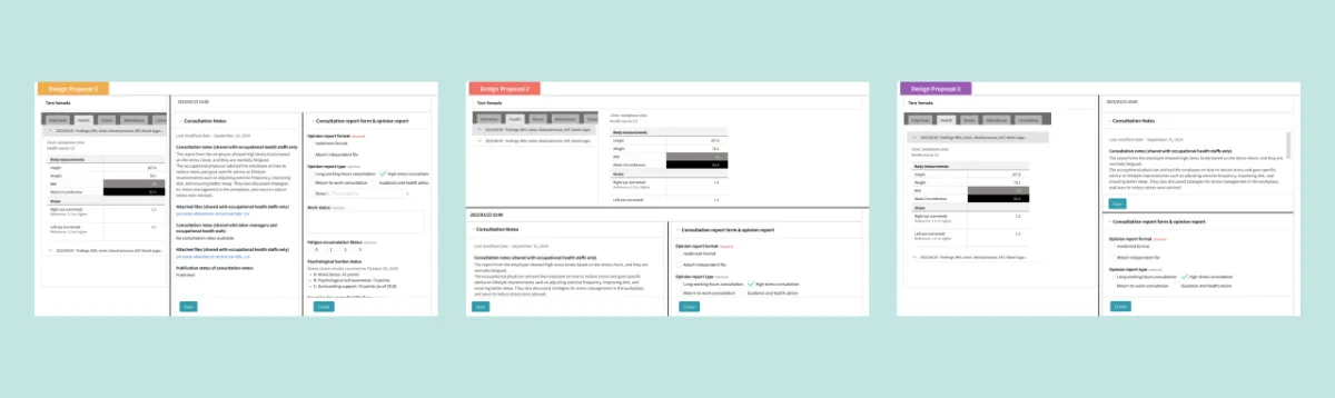
Using the interviews, empathy maps, and journey maps, I organized user challenges and goals and explored several rough layouts that allow note-taking while reviewing documents.
I checked the direction with occupational health professionals. They preferred a layout similar to electronic medical records used in hospitals because it was familiar to them.
Design
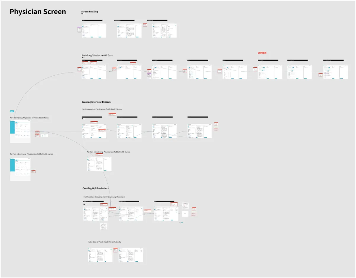
Digital Wireframes
I created wireframes including screen transitions and reviewed the overall concept with the project manager.
Hi-Fidelity Designs
I developed the high-fidelity designs from the digital wireframes.
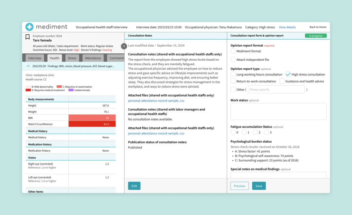
View Employee Data, Create Notes, and Reports on a Single Screen
The layout helps busy occupational health professionals conduct consultations efficiently.
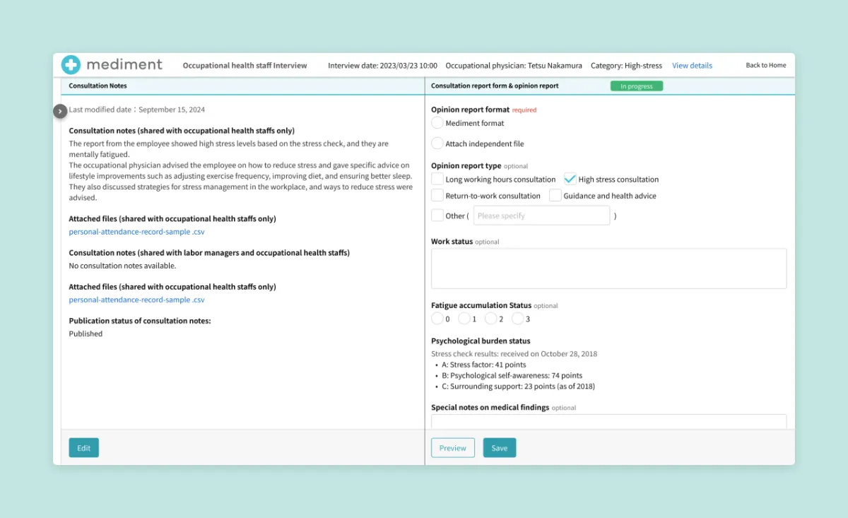
Close Health Data Tab
Closing the health data tab lets professionals focus on consultation records and opinion letters.
Health Data Tab
Professionals can view an employee’s current and past health status at a glance.
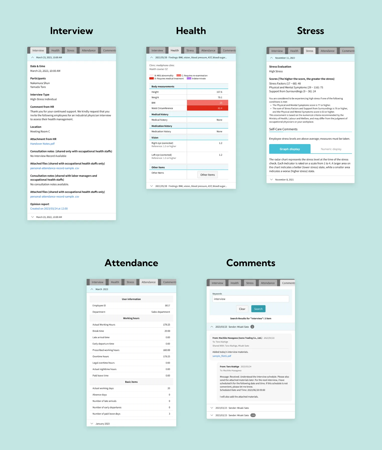
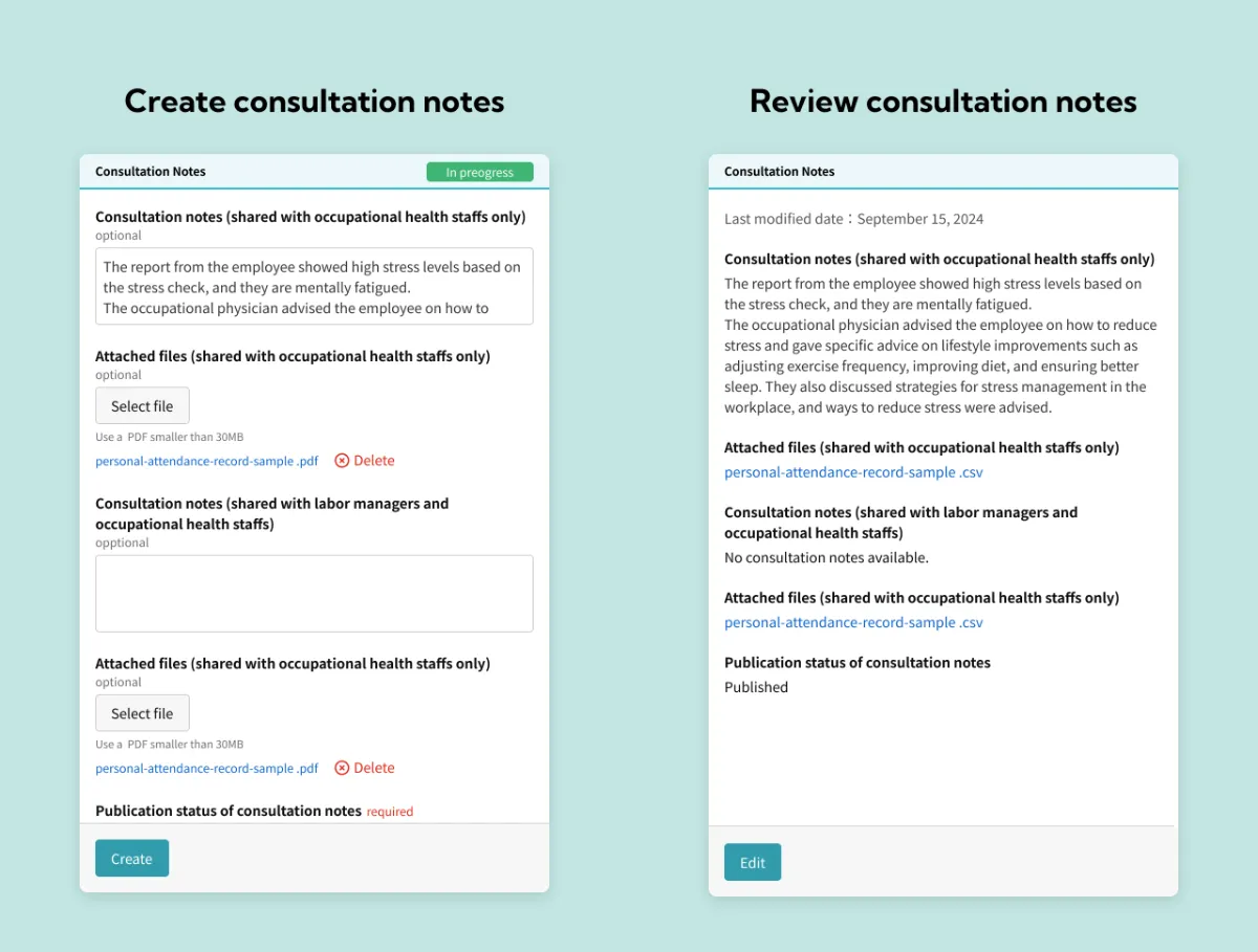
Consultation Notes
Consultation notes can be reviewed by other occupational health professionals and labor managers.
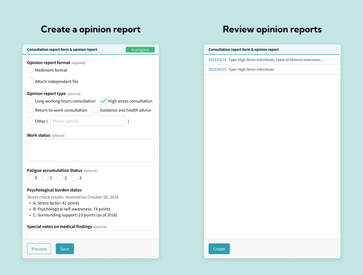
Consultation Report Form & Opinion Report
If an opinion report is required after the consultation, it can be completed here and reviewed by other professionals and labor managers.
Hi-Fidelity Prototype
I created a high-fidelity prototype based on the digital wireframes.
Prototype Link ↗Going Forward
Takeaways
Impact
- Occupational health doctors reported that the feature was easier to use and allowed for quicker consultations.
- After release, the feature contributed to new contracts, resulting in a 4% increase in ARR.
What I Learned
- Fitting all the information compactly and clearly on one screen was challenging.
- Working with occupational health professionals and incorporating their reviews helped refine the design.
Next Steps
Although recording consultations became easier, users still found report creation somewhat inconvenient. The next step is to improve this part of the experience.