I designed a minimal yet user-friendly e-learning feature for the health management system within a two-month deadline.
By creating multiple design proposals early on and collaborating with the PM and developers to define key features for the first release, I ensured timely completion.
As a result, we completed the design and implementation in just two months by prioritizing essential elements and functionality, which led to a 2% increase in ARR from upsells.
Timeline
1 person-month
Role
UX/UI Design, Graphic Design, UX Research, User Testing
We delivered the design and implementation in two months, boosting ARR by 2% through upsells.
The Situation
The Product
"mediment," a cloud-based health management system, enables HR managers to manage and analyze employee health data to support their well-being.
Problem
HR managers want to educate employees on health but often lack the time to create educational resources, and "mediment" doesn’t currently offer this feature.
Goal
The goal is to empower HR managers to educate employees about health and reduce the number of employees facing health issues, all without added complexity.
Constraints
I had to complete and hand off the design for a new e-learning feature within two months. To ensure alignment with the team, I created multiple proposals early on and collaborated with the project owner to prioritize key features for the first release.
Solution
By offering an e-learning feature through mediment, HR managers can effortlessly provide health education to employees, ensuring a hassle-free process that promotes better health awareness and reduces health-related challenges.
Design Process
After consulting among the designers, I followed a process based on design thinking.
Research
Competitive Audit
I researched three learning platforms to understand which UX/UI features help users learn more easily.
Competitive audit conducted during the project
Service
Feature
Strengths
Weaknesses
Udemy
Offers a wide variety of courses from global instructors.
Many features to support learners.
Lacks practice exercises in most courses; users may find it hard to focus on learning due to the abundance of features.
Coursera
Provides high-quality courses in partnership with universities and companies, offering certificates and qualifications.
Easy-to-track progress; includes exercises to reinforce learning.
Some transitions and behaviors on the platform feel awkward
Schoo
Japanese-based online learning platform with a focus on IT and business, offering live classes.
Simple and user-friendly interface; companies can combine various materials to create custom courses for employees.
Lacks features like progress tracking and exercises, resulting in fewer overall functions.
User Story
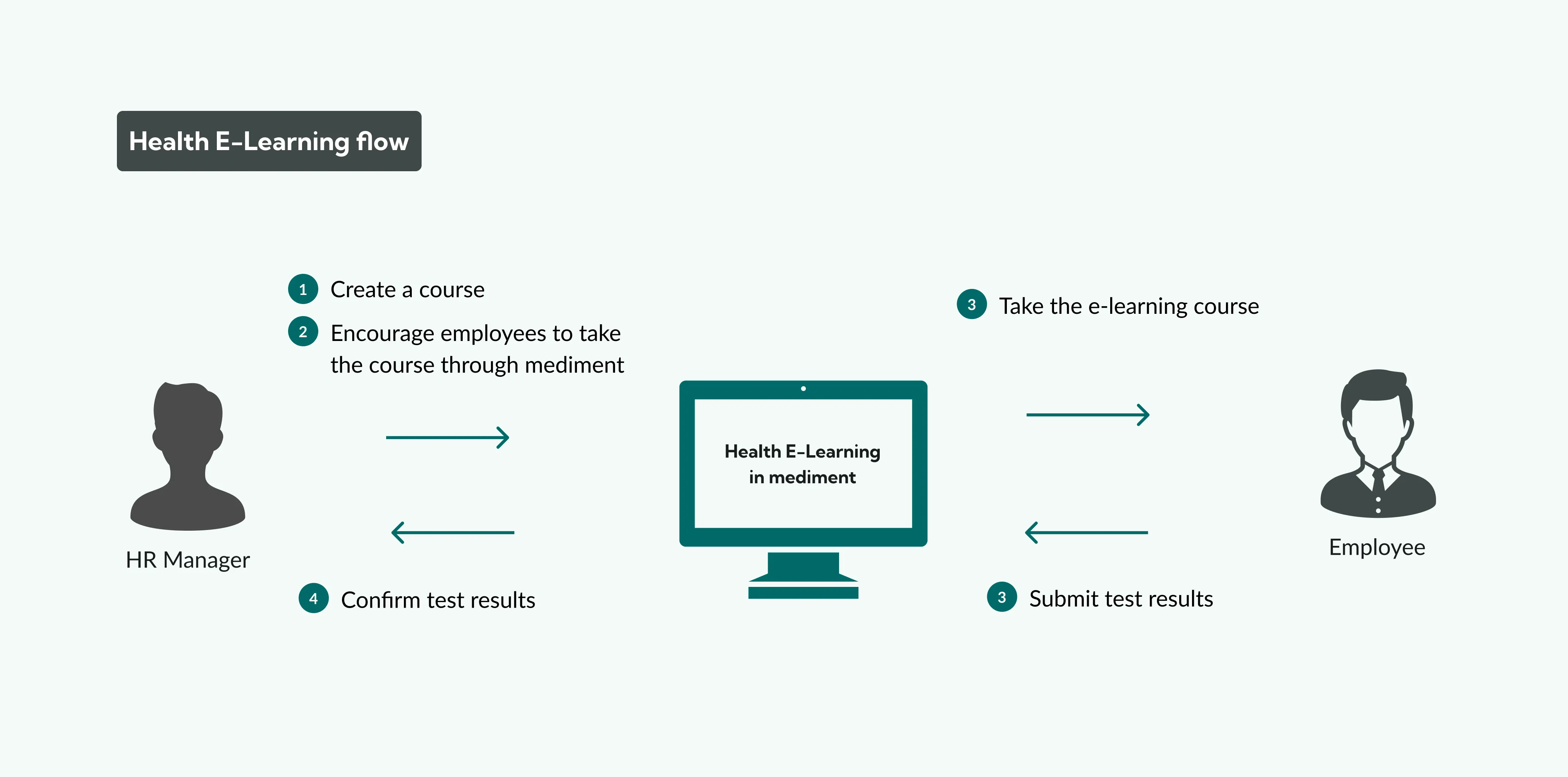
I summarized user stories to demonstrate how HR Manager and employees would use the E-Learning feature.
HR Manager
Ensure employees complete the E-Learning courses.
Create a Course
Enter the course name
Select the learning materials
Choose the participants
Set the course duration
Encourage Employees to Enroll
Select the Employees to Send the Email Encouraging Enrollment in the E-Learning Course
Write and Send the Email Content
Remind Non-Participants
Check the enrollment status of participants
Review the progress of employees
Select non-participants to send a reminder email
Write and send the email content
Confirm Test Results
Navigate to the "Test Results" tab in the course details
Click on a specific employee's test result from the list
View the detailed test result
Employee
Complete the E-Learning course created by HR Manager.
Access the course
Receive an email from the HR Manager about the course
Access the course from the email
Complete the E-Learning course
Review the course materials
Take the Test
Read the test results and explanations
Complete the course after finishing the final material
Design
Digital Wireframes
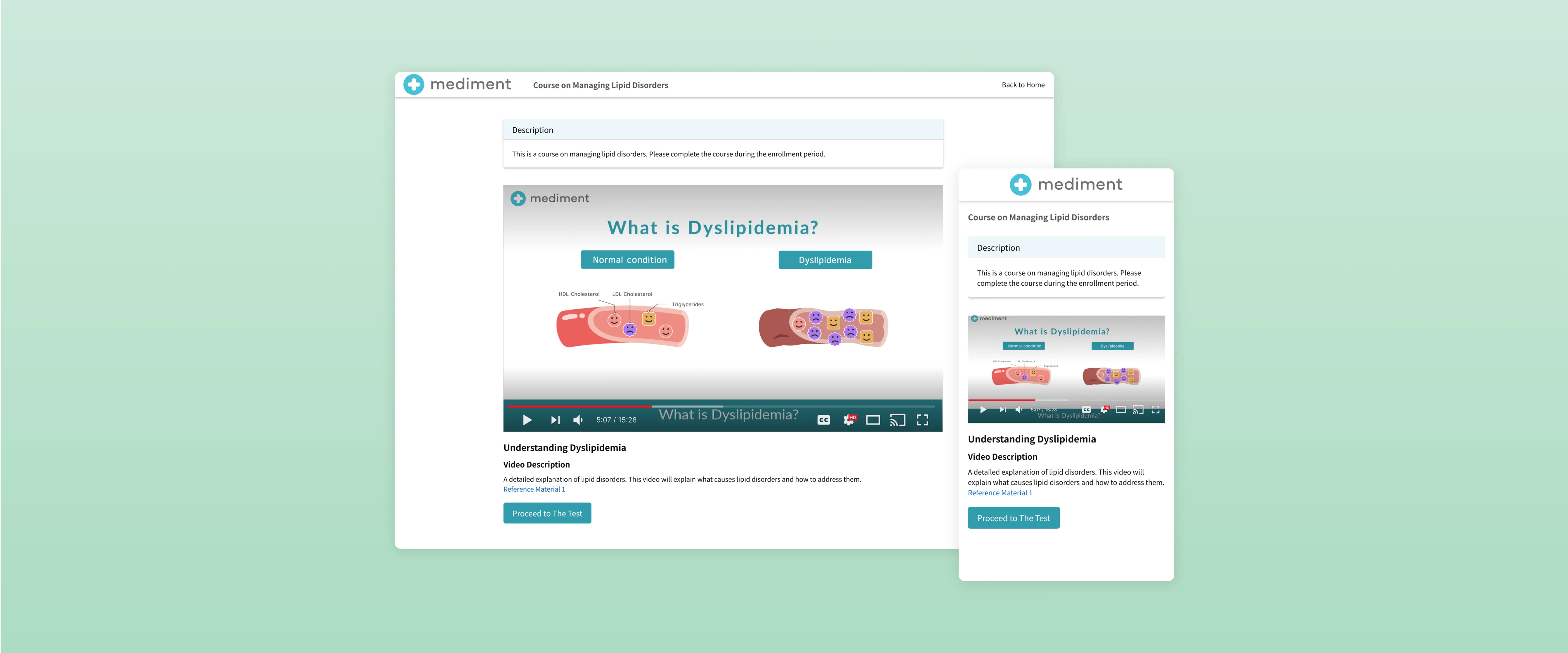
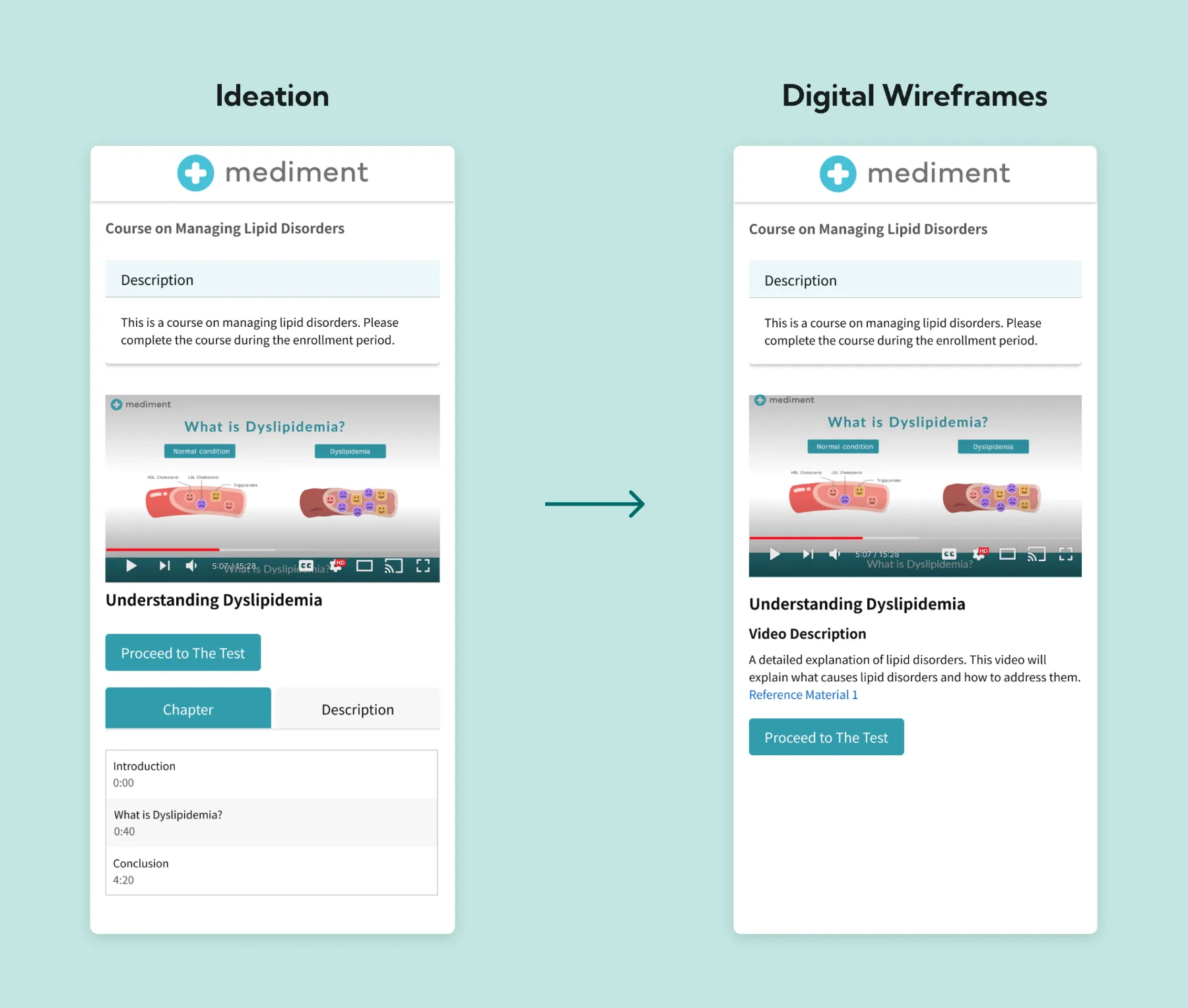
I created detailed designs based on the ideas, balancing development time with user satisfaction for the first release. Specifically, I removed the display of video chapters from the screen and simplified it to just the video and its description.
Balancing Development Time with User Satisfaction
I removed the display of video chapters from the screen and simplified it to just the video and its description.
Refining The Design
Hi-Fidelity Designs
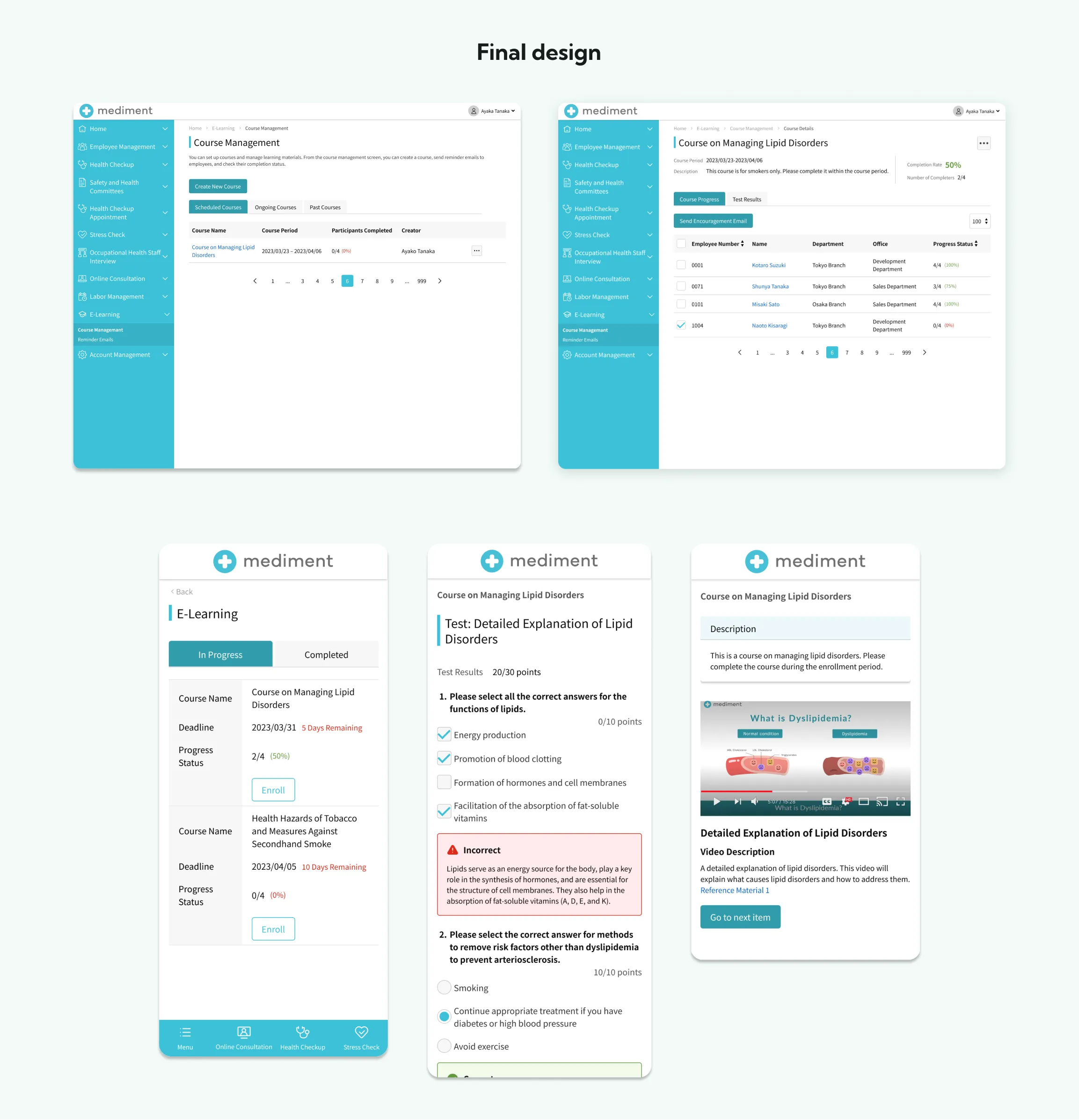
I created high-fidelity designs based on the wireframes and made adjustments after discussing implementation considerations with engineers to ensure practical usability.
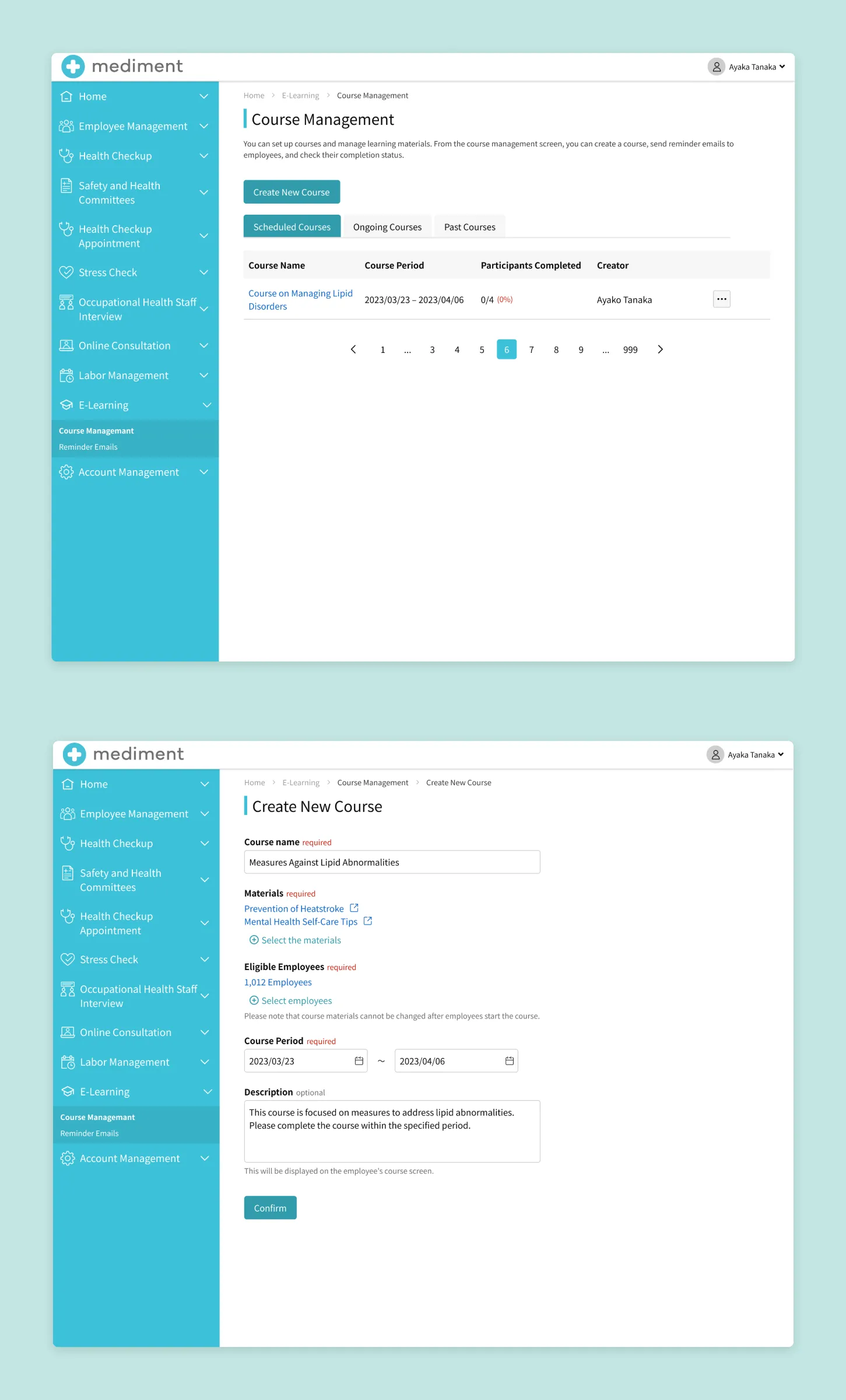
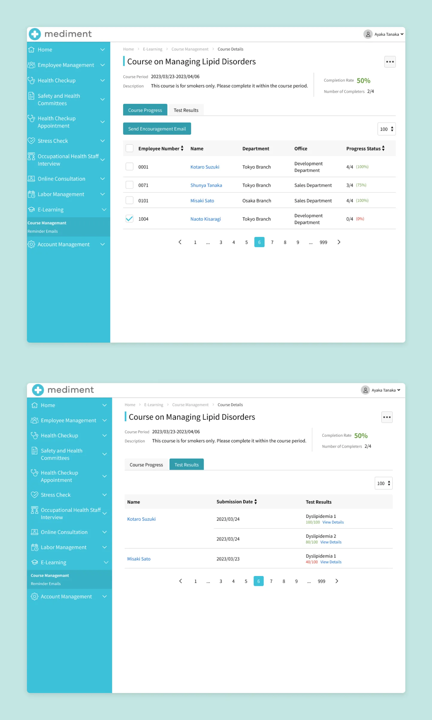
Course Management and Creation Screen (HR Manager Screen)
The HR Manager can input the study materials, participants, and period to create E-Learning courses. It is also possible to edit or delete the created courses.
The HR Manager can check the progress and test results of participants in the created courses. Recommendations for course enrollment can also be sent in bulk from the screen.
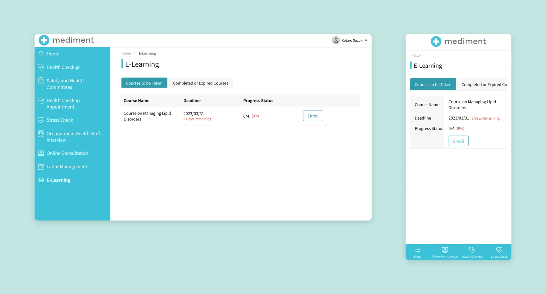
E-Learning Home Screen (Employee Screen)
Courses are categorized as either "To Be Taken" or "Completed/Expired." For "Completed/Expired" courses, employees can still access and review the study materials.
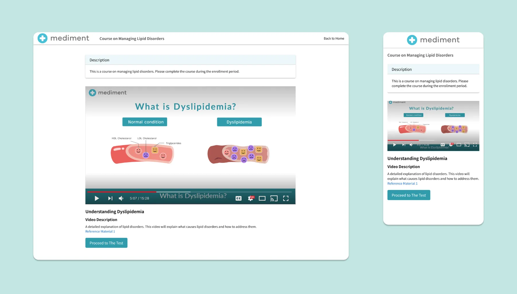
Study Material Viewing Screen (Employee Screen)
Employees can view the study materials set by the HR Manager and gain knowledge related to health.
Test Screen (Employee Screen)
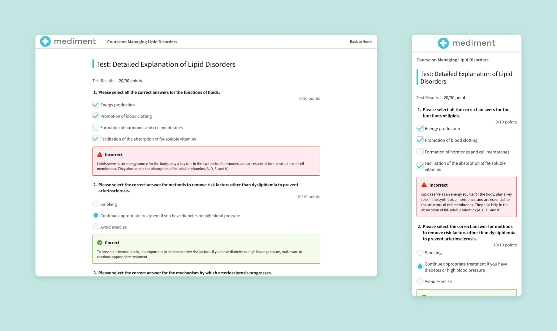
Employees can take tests, review their results, and check the explanations.
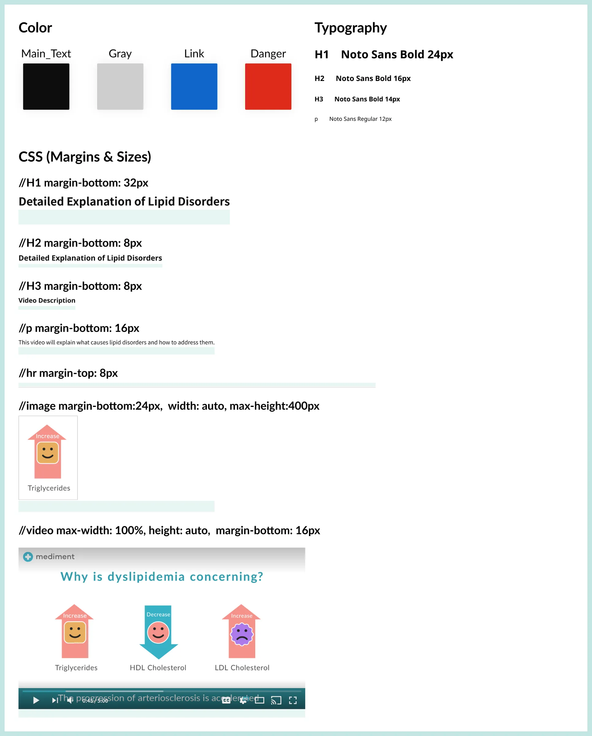
I developed a style guide for the rich text editor used to create E-Learning materials, ensuring consistency across the content.
Video Design for Learning Materials
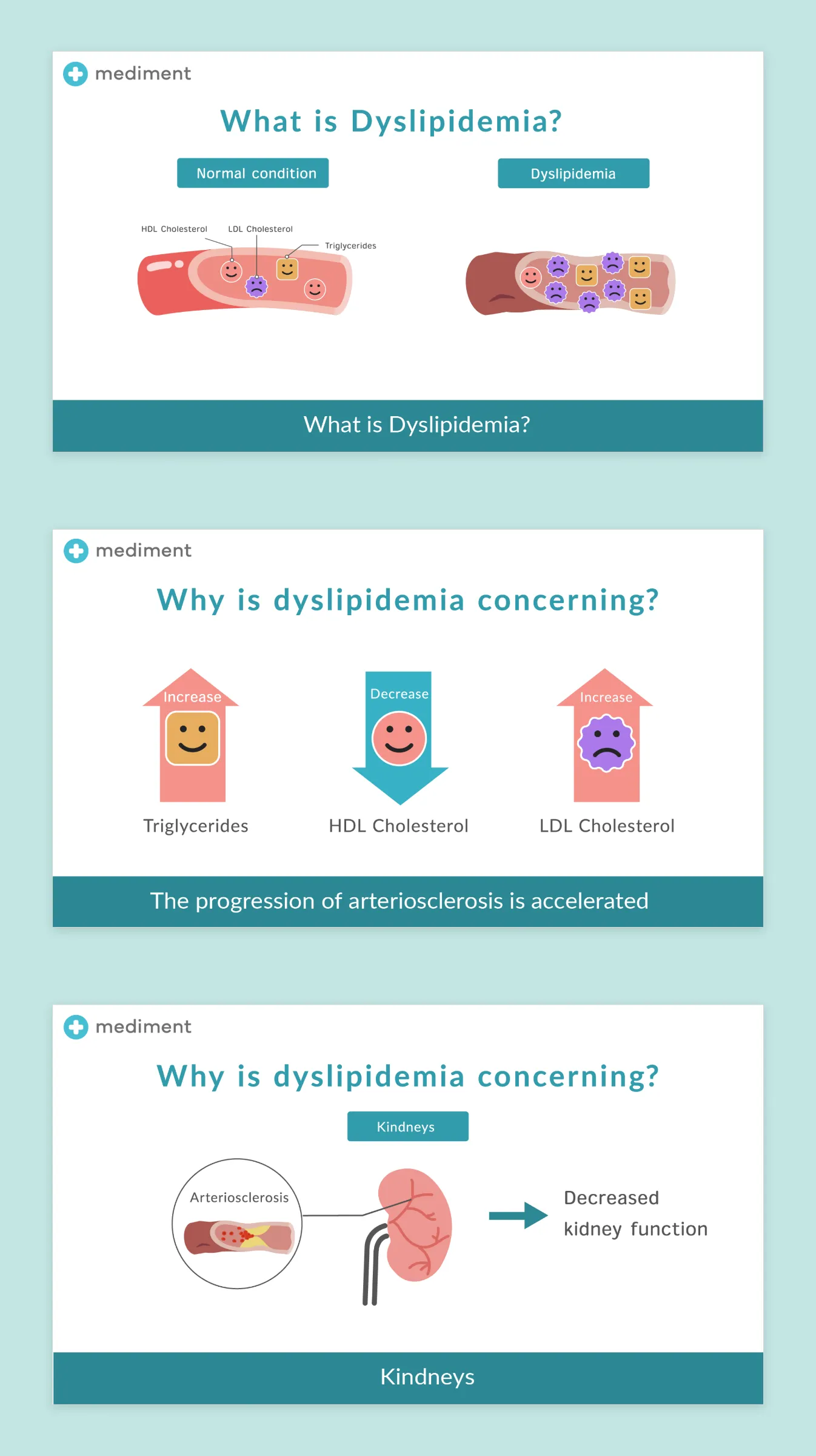
Using Illustrator, I created designs for three educational videos for HR managers creating courses. I collaborated with in-house nurses to draft the scripts and worked with external motion designers for music and animation. These illustrations and a video are part of the design work I contributed.
After implementation, I conducted usability tests with internal designers. The results showed no significant usability issues, but some text was unclear, so I worked with engineers to make improvements.
Going Forward
Takeaways
Impact
Despite a new feature, we completed design and implementation in just two months by collaborating closely with the PM and engineers to identify and focus on the essential design elements and functionality.
This new feature contributed to a 2% increase in ARR through upselling.
What I learned
From a UX perspective, I learned the importance of designing features that cater to both HR managers creating courses and employees taking them, focusing on what is essential for a seamless experience.
From a design perspective, I worked on responsive design for the first time in a professional setting, ensuring usability on both mobile and desktop.
Next Steps
After the release, I received feedback from users requesting the following improvements, which I plan to design in the future:
The ability to select course participants based on employee symptoms.
The ability for HR Managers to create custom educational materials.